

Simple CSS Animation for ePub
Date: 30 March, 2013
We get quite a few queries and seach keywords on our websites looking for information on creating simple CSS animations for ePub3 Fixed Layout. In this post I am sharing some simple techniques that can be used to get some simple animations working.
Introduction
We get quite a few queries and seach keywords on our websites looking for information on creating simple CSS animations for ePub3 Fixed Layout.
In this post I am sharing some simple techniques that can be used to get some simple animations working.
Preparation
Before starting it is important to have all the required inputs, ideas and concepts in place. We need to make ourself clear to ourself! Once everything is in place the actually CSS animation is pretty easy.
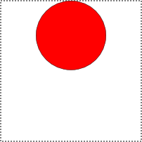
For animation getting the artwork done is the very first process. With good quality art that was not designed for animation it means a lot of graphics work cutting out the pieces. We are going to animate a person waving and nodding so the first step is the artwork to make character, then splitting the character into the parts required for the actual animation.
Here are the images we're using for this simple (but dignified) animation stick-figure tutorial. This took about 10 minutes in Inkscape. This article is not about showing beautiful artwork, it is about showing very basic and simple techniques to get simple animations for ePub3.
Simple Nods and Waves - Center rotation
In this first demonstration, we're going to make our stick figure wave his arm and nod his head.
To assemble the arm animation, we need character image with an arm missing (or more correctly a separate arm image).
And to assemble the nod head animation, we need character image with a separate head image.
Waving arm
Lets have a quick look at the "Waving arm" example. Here we have used very simple HTML. One outer parent <div class="animation-wave"> to give us a little bit flexible to position the child image elements in the outer parent element. There are three <img> child elements as head, body and arm as all three different images.
Wave Arm HTML
<!-- HTML -->
<div class="animation-wave">
   <img class="head" src="head2.png" />
   <img class="body" src="body2.png" />
   <img class="arm" src="arm1.png" />
</div>
It's time to position the three images elements. Here is the layout CSS for the HTML. Here is the CSS to position head, body and arm inside their parent <div> element. The parent container is made the required size and set to position:relative; so the absolutely positioned intems inside can be placed pixel perfect.
In this first demonstration we are using images that have been manipulated to have the animation rotation point in the center of a PNG image with transparency. This is a common technique for simple animations and means you can use one CSS animation for many items in a book. The example animated images have grey borders so their size can be seen. With this technique there is a lot of pixels being moved.
Setup CSS for Wave arm position (Click to view)
Now we are ready for the actual animation CSS to make the arm wave. This uses a CSS transform rotate to make the arm move vertically by 15 degrees.
In this simple example we're using only three animation mandatory properties though there are lot more properties available.
img.arm {
    -webkit-animation-name: arm;
    -webkit-animation-duration: 1s;
    -webkit-animation-interation-count: infinite;
    animation-name: arm;
    animation-duration: 1s;
    animation-interation-count: infinite;
}
animation-name: This defines the animation name of the given element so that the selector can be manipulated with CSS using @keyframes arm: The animation name can be anything you want it to be as long as it matches in the two places, animation-name and in the @keyframe.
animation-duration: This is how long you want your animation to run when it is started. We've set a 1 second duration. This can be easily changed.
animation-iteration-count: This is to tell number of counts you want your animation to run in continuous repetitive loops. 1 loop equals the duration time, and all the animation action happens within duration time. In this example we're set iteration-count value to "infinite" as we want animation to run continuously while the page is open. Allowed values are "1, 2, 3... etc.".
The rest of the unused animation properties are optional. They will be used with their initial default values in the DOM.
Now to the action bit.
@-webkit-keyframes arm {
    50%  {-webkit-transform: rotate(15deg);}
    }
@keyframes arm {
    50%  {transform: rotate(15deg);}
    }
@keyframes arm {...}: This is where from you create your actual animation by manipulating the CSS properties. There are a number CSS properties that can be used inside the @keyframes to transform just CSS properties into animation. We are using the CSS3 transform:rotate property and rotating the <img> arm element by 15 degrees in 1s continuously.
50% {transform: rotate(15deg);}: We have used this inside the @keyframes. What this means is that animation starts at 0% and 0deg rotation, animates towards to 50% and 15deg rotation. This is in half way stage of the 1s duration. Next the second half the animation starts from 50% and heads towards to 100% while rotation goes backward from 15deg to 0deg. The 50% and 15deg values can be changed to any required values.
There are two ways of using @keyframes rule.
- Using percentage from 0% to 100%.
- Using "from" and "to" when you have only two animation actions happening. These keyframes rules can be mixed but it is probably best not to.
Wave arm animation CSS
img.arm {
    -webkit-animation-name: arm;
    -webkit-animation-duration: 1s;
    -webkit-animation-interation-count: infinite;
    animation-name: arm;
    animation-duration: 1s;
    animation-interation-count: infinite;
}
@keyframes arm {
    50%  {transform: rotate(15deg);}
    }
@-webkit-keyframes arm {
    50%  {-webkit-transform: rotate(15deg);}
    }
Adding a Nodding head
We can now add more animation elements. We are adding a nodding head but with different timing.
Wave arm and Nod head HTML (Click to view)
Setup CSS for Wave arm and Nod head (Click to view)
Wave arm and Nod head animation CSS
img.head2 {
    -webkit-transform: rotate(-7.5deg);
    transform: rotate(-7.5deg);
    -webkit-animation-name: head;
    -webkit-animation-duration: 0.5s;
    -webkit-animation-interation-count: infinite;
    animation-name: head;
    animation-duration: 0.5s;
    animation-interation-count: infinite;
    }
@-webkit-keyframes head {
    50%  {-webkit-transform: rotate(15deg);}
    }
@keyframes head {
    50%  {transform: rotate(15deg);}
    }
img.arm {
    -webkit-animation-name: arm;
    -webkit-animation-duration: 1s;
    -webkit-animation-interation-count: infinite;
    animation-name: arm;
    animation-duration: 1s;
    animation-interation-count: infinite;
}
@-webkit-keyframes arm {
    50%  {-webkit-transform: rotate(15deg);}
    }
@keyframes arm {
    50%  {transform: rotate(15deg);}
    }
Optimized Image Approach
The optimized approach is showing how you can minimize the use of CSS animation properties and the size of image by reducing the image dimensions to the actual visual dimension size. When we make something especially for interactive ebooks, we first have to think of mobile device limitations. We want to make our product compatible in all platforms including all kind of tablets and other devices. We have to optimize for the minimum resource consumption, especially CPU.
In above example we were using double size image as transform rotation was happening from the center center position from both side. But in this example we have optimized the image size to only the visible area and used transform origin to tell the animation the start position.
HTML
The HTML is pretty much the same except for image file names.
<div class="animation-wave-op">
    <img class="head-op" src="head2.png" />
    <img class="body-op" src="body2.png" />
    <img class="arm2-op" src="arm2.png" />
</div>
<div class="animation-nod-op">
    <img class="head2-op" src="head2.png" />
    <img class="body-op" src="body2.png" />
    <img class="arm2-op" src="arm2.png" />
</div>
Setup CSS (Click to view)
This time we have to fiddle a little more to get the position of each edge of the image into the animationcorrect position.
Optimized Animation CSS (Click to view)
Most importantly here is using the transform origin to match the edge of the image where the animation needs to be rotated.
Optimized animation CSS is about using shorthand syntax properties. The animation property being used just once for three different values in the previous example above.
animation: arm2-op 1s infinite; First value "arm2-op" is the animation name, second value "1s" is animation duration, and third value "infinite" is the iteration count. Generally sequence doesn't matter as the browsers work hard to recognize the values. But there are two animation properties that uses time value. "animation-duration: 1s;" and "animation-delay: 2s;". In this case if you're writing short-hand CSS you have to be careful or aware of that first time value is taken as duration and the second is taken for delay.
Bouncing Ball
Just for something different here is a simple bouncing ball animation to show a different variation (out of thousands of possible variations) of animation. This shows ball bouncing up and down in infinite loop and also changes its shape with a little bit of stretch and squash to make it little bit real.
Bounce Simple HTML (Click to view)
Bounce Simple Setup CSS (Click to view)
Bounce Simple Animation CSS
In this bouncing ball example, we are using CSS3 transform translateY feature to make ball go up and down and scale(X Y) to squash and stretch the ball as it hits ground and roof. Also another thing to notice here is that we're using "from" and "to" @keyframes rule instead of % as used in example above.
Here we have added one extra animation value used which is alternate as we want ball bouncing from both ways. It's short-hand property is "animation-direction" and the allowed values for this is " normal | reverse | alternate | alternate-reverse". The default value is normal.
transform-origin is set to center bottom as to make ball bounce up from the bottom.
Where possible always use transforms for animation rather than animating CSS positions. With transforms the rendering only happens once and the rendered object is manipulated. If you are animating CSS positions using top, left, right and bottom the entire set of objects are rendered on each animation frame consuming a lot more CPU resource.
Of course you can go crazy with many balls and many animations happening at the same time. With little bit of more complex HTML structure and CSS. The difference in this example is the additional div which is used to move sideways.
When CSS animating for ePub in mobile devices you have to remember the CPU limitations of the devices so don't go too crazy. Our sample Antonio's Tale fixed layout ePub3 brings tablets to their knees because of the CSS animation of the mountain background.
Bounce Ball HTML (Click to view)
Bounce Ball Setup CSS (Click to view)
Ball Animation CSS (Click to view)
Summary
You can download all of the demonstration files used above in the example as a single ZIP here. Download
That's it. A few simple techniques for simple animation in ePubs using CSS because of the searches that find our various resources sites. We hope this post will help our visitors to some extent.
Rather obviously this post is not an animation revolution or designed to impress with the artwork. It is about the basics. It is good to start from the scratch and understand the first-principles rather then diving into the advance stuff.
Nodding, waving, bouncing animations may not make the most engaging childrens books, but with a little javascript may not be masterpieces but can be interactive and engaging entertainment and also useful for education content as well.
Posted by: Milan Bishwakarma
Start a real digital content strategy with
IGP:Digital Publisher
The complete digital publishing content management and production solution.
Available as for Small and Medium publisher:
IGP:Digital Publisher is also available as a full site license purchase.
Contact us for more information...
Use one master XHTML file to instantly create multiple print, e-book and Internet formats.