

Adaptive Aspect Ratio for
Fixed Layout ePub3
26 December 2014
Using IGP:Digital Publisher to create Adaptive Aspect Ratio ePub3 books for education publishers around the world
During the first half of 2014 we were producing fixed layout text books either for workstations and mobile devices with 16:9 OR 4:3 aspect ratios. However the aspect ratio specification limitations of ePub3 and reading systems has become a real issue for many education publishers and their users.
Here is the sort of "startup" conversation we have with education publishers working towards a digital strategy:
The publisher says: We need to publish fixed layout digital text books. Schools are demanding our books are available in digital editions.
We say: Certainly. What devices are you targeting. Android or Apple?
The publisher says: All devices. The schools and students use Android and iPads so we need everything. EPub3 works on all platforms right!
We say: Yes it does, but for fixed layout ePub3 the specification states you have to set a viewport size optimized for an aspect ratio. It will then be presented in other aspect ratios as a window in the viewport.
We show them examples and explain: Here it is designed for iPad at 4:3 displayed in typical 16:9 Android device. You have the flexibilty to design for fixed layout landscape or portrait orientation...
...and here it is designed for Android at 16:9 and displayed in a 4:3 iPad device.
The Publisher says: This can't be real. All that wasted screen area. Is this really the best we can deliver to our learners in 2014?
We say: Yep! These are the ePub3 reading system realities. However... IGP:Digital Publisher has specific tools that enable you to design for all aspect ratios and output ePub3 files for your target device users. Design once and target many ePub3 reading systems on many devices. We call it "Dynamic Aspect Ratio" production. But it does need some rethinking from yesterday's design thinking.
The Publisher asks: Does this mean we have to distribute two versions of each book if we want to use fixed-layout page presentation? One for 4:3 iPad and one for 16:9 Android?
We say: Yes. This is a fact of life at the top of 2015. However if you distribute your books using the AZARDI reading systems we have a custom feature that lets your content adapt to the aspect ratios of any device the reading system is installed on if it is designed correctly. This is important for delivery to workstations as well as mobile devices.
You have to have the tools and methods to specifically design and produce your content to address this situation... and you have to have a reading system that is Aspect Ratio Adaptive.
The publisher says: (Groan) I hate digital content! OK. Show me more.
Background
The challenge of designing fixed layout content for all devices, aspect ratios, screen sizes and orientations is daunting.
The differences in the content presentation area across different viewports is large; from the squat and ugly 4:3 screens of yesterday, to the slim and elegant 16:9 screens of today. Mobile devices adds portrait and landscape orientation viewing PLUS a wide number of screen sizes to the aspect ratio challenges. None of the content is being delivered through the expensive convenience of Apple's iStore or Amazon to known devices. That business model is too punitive for the mass distribution of text books.
The fact is most of the mobile devices around the world suitable for engaging with education content are 16:9 aspect ratio. In developing world markets we have to reasonably look at delivering fixed layout (and reflowable) education content from 12-15cm (5in) 16:9 devices. That's the devices that are predominantly affordable and available.
The screen area difference between 4:3 and `16:9 (for the same height) is 25% as seen in the illustration below. That's a lot of area. The aspect ratio challenge for book production will not getting easier as device manufacturers fight for market share. With mobile devices screen size is a major competitive feature, and a major affordability issue in many education markets around the world.
To be fair the 4:3 and 16:10 are better aspect ratios if you are trying to replicate print book presentation with animated flipping pages. However digital content is getting past the slightly silly paper/paging metaphor (education content in particular) and is starting to be optimized and explicitly designed and extended for digital device engagement. With good reason the scrolling page is making a return.
The ePub Spec Today
The ePub3 fixed layout specification defines an ePub should have just one height and width statement. We have tutorials explaining how to design and work with that here. The Fixed Layout spec does not say how a reading system should use those values, but most fixed layout content is produced to treat the viewport as a locked off shape. In the real world education publishers need to address a wide range of mobile devices. While the wasted space is not a big factor on workstations, it is a significant issue on mobile devices.
We needed to devise a solution that filled the screen for all apect ratios and worked everywhere. However the following challenges had to be addressed:
- A design and production methodology for fixed-layout so the content fits a defined range of aspect ratios.
- The flexibility to address ePub3 reading systems behaviours and capabilities if they are specification compliant.
- Address all device AND workstation platform common viewport aspect ratios.
Fortunately we have the production tools (IGP:Digital Publisher) the ePub3 delivery system (AZARDI:Content Fulfilment) and the only all-platform reading system (AZARDI). so we could work through this problem to deliver a working, and hopefully elegant, solution.
Elasticity, Cropping, Crop and Scroll
There are a number of approaches that can be used at the page and block level. Content cropping (with or without scrolling) and elastic blocks.
The content cropping approach works for simple kids books where the action is generally in the middle of the viewport and 12.5% of the viewport can be cut off left and right. In this case you are more or less designing in the 4:3 aspect ratio with edge art overflow for 16:9. It's a compromise but a lot of simple nodding-head content out there fits this requirement.
Another approach is to orient the 4:3 viewport to the center, left or right and give a short horizontal scroll if the content is appropriate (for landscape fixed-layout); and a vertical scroll for portait oriented fixed layout.
When we move away from children's fixed-layout content to advanced learning and training content with sophisticated Q&A, widgets, significant on-screen text and other features, the elastic block approach works best. In this case you are designing for the 16:9 aspect ratio and testing for the compressed elasticity of blocks in the 4:3 aspect ratio. Or you are designing for the 4:3 aspect ratio and testing for the stretched elasticity of blocks in 16:9. It works surprisingly well.
And finally there is a tendency to design fixed-layout content for landscape (as we have done on our computers for years) when portrait orientation is probably the best option for a lot of content on mobile devices. This is another challenge worthy of it's own discussion.
CSS Percentage to the rescue
The solution was the appropriate use of CSS percentage grid and unit sizing. Creating aspect ratio adaptive "fixed-layout" content introduced new challenges, but more importantly it introduces a real and working solution for Adaptive Aspect Ratio ePub3 publications on any device. Animation, widgets, Question and Answers and other layout components easily adapted to a percentage design framework.
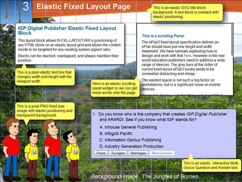
This is an adaptive fixed-layout page displayed in a 1024px X 768px viewport (4:3 Aspect Ratio). The flexible gridlines are more closely spaced than in the image below. The current grid is 64 X 64, giving 12px per grid unit in the vertical direction, 16px horizontally for 1024px and 21px (approx) for 1366px.
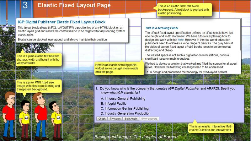
This is the same adaptive fixed-layout page as above but displayed in a 1366px X 768px viewport (16:9 Aspect Ratio).The vertical gridlines are more spaced out than above. All the speech balloons are CSS styled fixed layout blocks. Of course this demonstration has too much reading content on the page if the target screen size is five inches. But that is a design-time consideration and a different article.
Finally here is a representation of a landscape 16:9 fixed layout page side-scrolling in a 4:3 landscape viewport. The scrolling viewport is created by the AZARDI reading system at presentation time depending on the page properties given in the ePub3. This could also be vertical scrolling in a 16:9 viewport if the page was created at 4:3 aspect ratio.

For those using IGP:Digital Publisher here is an example of the content-block fixed-layout toolbars for the different positioning and sizing properties. This can be easily customized by publisher and even book series to dramatically improve productivity. Height and width units can be viewport percentage, pixels or grid units.
Summary
We are now working with publishers to create Aspect Ratio Adaptive ePub3 books.
For education publishers creating their content with IGP:Digital Publisher and delivering on various reading systems they need to export two ePub3 packages for each book if that is their market requirement. One at 4:3 and the other with the 16:9 aspect ratio.
When a publisher is delivering with AZARDI:Content Fulfilment to AZARDI readers on any desktop or mobile device the ePub3 presentation adapts to fill the screen dynamically and automatically. Only one ePub3 package is required for every target platform and device.
Adaptive Aspect Ratio design is a significant step forward in education content presentation. It significantly reduces the costs of fixed-layout production and long-term content ownership for education publishers around the world.
As a further observation, with different design profiles in IGP:Digital Publisher this same HTML can be produced as a portrait oriented fixed-layout ePub3 AND/OR as reflowable/scrolling content.
Currently only the commercially licensed versions of AZARDI have Adaptive Aspect Ratio. Because the viewport properties are custom and a a work-around, and are not part of the ePub3 specification they are not published here to avoid promolgating any confusion.
Addressing the limitations of the ePub3 Fixed Layout Specification in various devices has become an urgent necessity to address real-world education digital content production and delivery challenges on todays platforms and devices.
Posted by Richard Pipe